Art
How Leo came to look like Leo
Three months, three rebuilds and a dozen-odd revisions. Every attempt Ascension's protagonist went through, including the ones that did not survive, up to the design that stays.
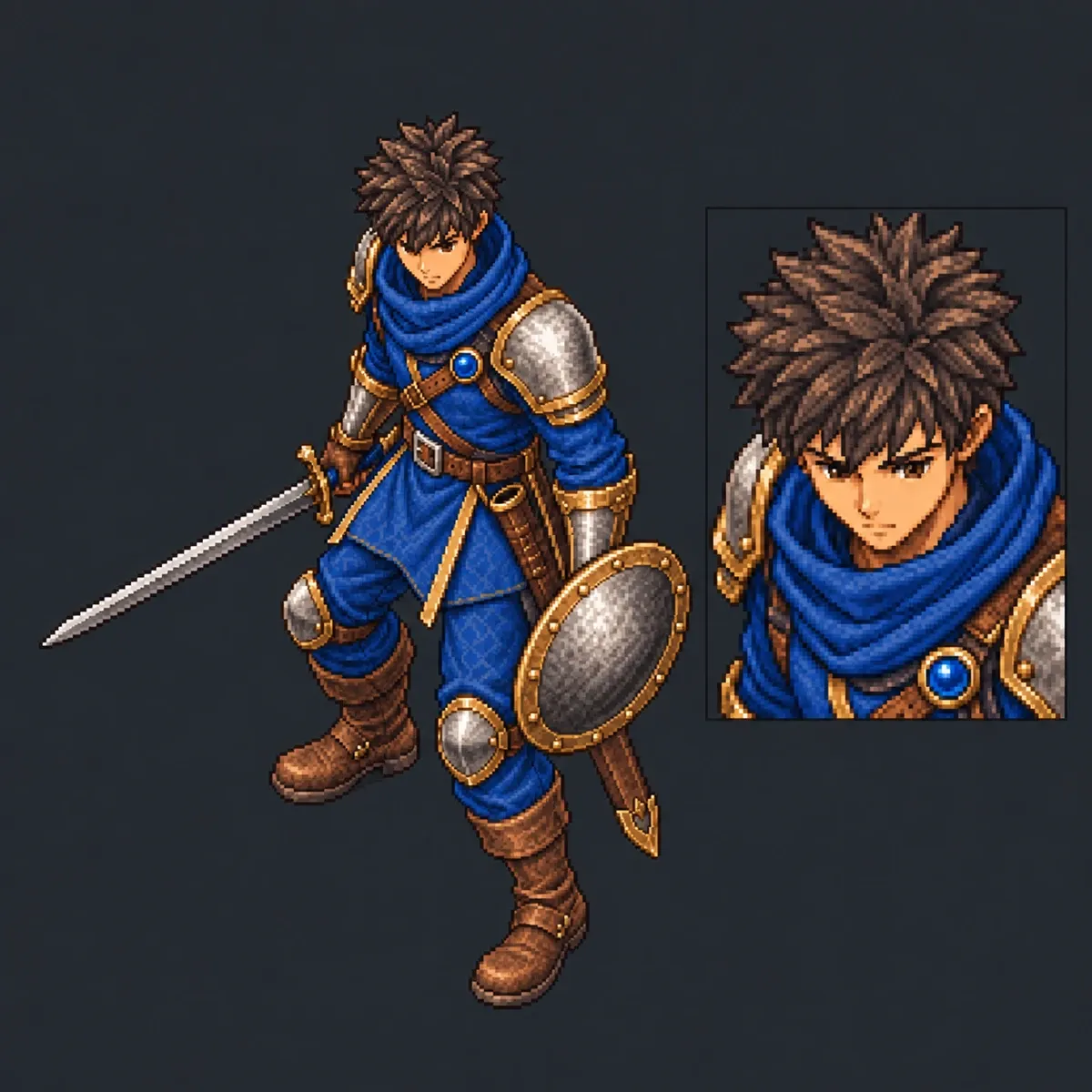
Leo is the first hero anyone sees when they open the game. He is also the one I have had to remake the most times. This is the full chain, including the versions that fell by the wayside and the exact reason each one did.
Update, 24 September. This entry is the full retrospective. Each milestone also has its own entry, with its own date: the first concept · the first playable Leo · the portrait from ten pixels · the selection artwork · the rebirth in 3D · Leo C · the 2D repaint.
And a warning about how this entry ends: finish C turned out to be the last pass in three dimensions, not the end of the line. On screen it did not fit, and the final finish is repainted in 2D over the 3D movement.
June · The first concept
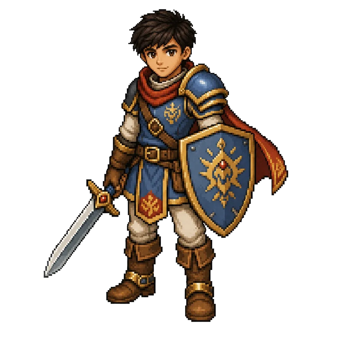
Here Leo was shorter and broader, with a red cape and an emblazoned shield. It is not bad, but it has a problem I was slow to see: this is an illustration character, not a game character. The flying cape and stocky proportions work in a still image and become a problem the moment you have to animate him in eight directions.
August · The pixel-art laboratory
The system that turns a character into eight-direction sprite sheets at 160 px was already working, and Leo was the first through it.
Out of it came the first genuinely playable Leo: a character generated with PixelLab, with his full walk cycle in all eight directions — sixty-four frames — ready to drop into Godot.
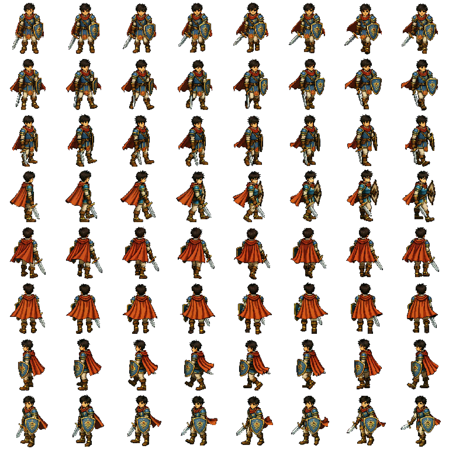
This is the Leo the game ran on for weeks. It works, it reads well in motion, and it is what made the prologue playable for the first time.
And here came the most instructive mistake of the whole process.
The portrait that came out of ten pixels
To get the dialogue portrait, I generated the bust from the in-game sprite: a top-down image at 112 px where the face takes up about ten pixels. There was no face to inherit, so the generator invented one — and it came out semi-realistic, which is the exact opposite of the game’s style.
The lesson, written into the repository so it does not happen twice: the source decides the style of the face. Feed it pixels and it will make a face up.
August · The design that rules the face
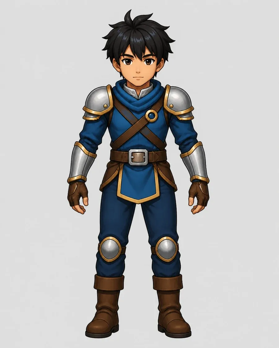
This is the design that fixes the canon of the face: anime face, spiky black hair, brown eyes, blue tunic with steel pauldrons and gold trim, crossed leather straps, square buckle, skirt with a gold border, knee guards, brown boots and fingerless gloves.
Notice what is gone: the cape. It disappeared for the same reason the scarf tail would disappear later.
31 August · The selection artwork
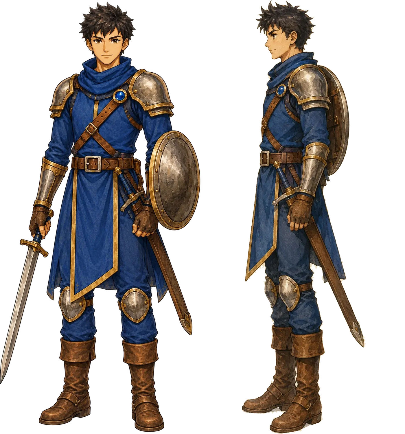
The previous design taken to final art, front and side, with the sword and shield integrated. This is canonical Leo, and from here he stops being a reference and becomes the source for everything else.
6 September · The rebirth in 3D
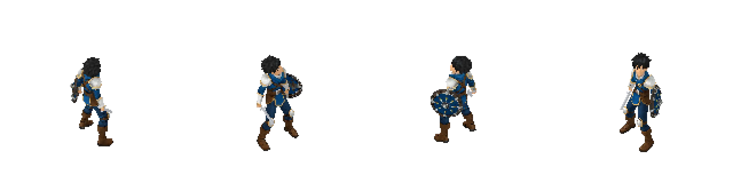
The decision: rebuild Leo in 3D from the selection artwork, at high quality and without rescaling, so there is a model with a wealth of detail that can then be dressed in pixel art. That needs a turnaround sheet of four views: front, both profiles and back.
It took three attempts.
v01 — rejected by contract
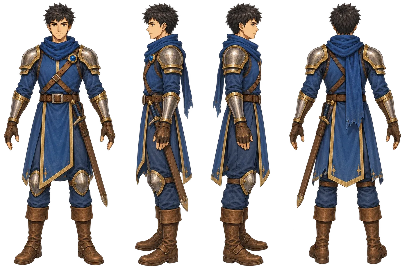
It came out with the sword sheathed. The concept-art contract forbids weapons in a turnaround, and not out of fussiness: the 3D generator reads the scabbard as part of the body, and afterwards the weapon cannot be separated to animate it. Discarded without discussion.
v02 — rejected by the critique
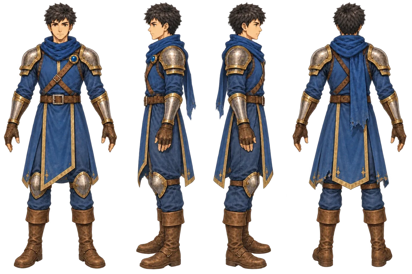
This one arrived weapon-free and still failed. Three defects:
- The scarf tail down to the hip, visible in the back and both profiles: close to 35 % of the figure. It is hanging cloth next to the arms — the same category of problem as Serge’s cape, where nearly a thousand foot vertices ended up driven by an arm bone. It is the defect that weighs most.
- The tabard covering the knee guards, which the selection design leaves visible.
- Hair as a round mass of curls instead of pointed locks.
And an objective check finished it off: the legibility gate — a measurement of tonal value and the number of colour families — failed it on the back view at 0.39.
v03 — approved
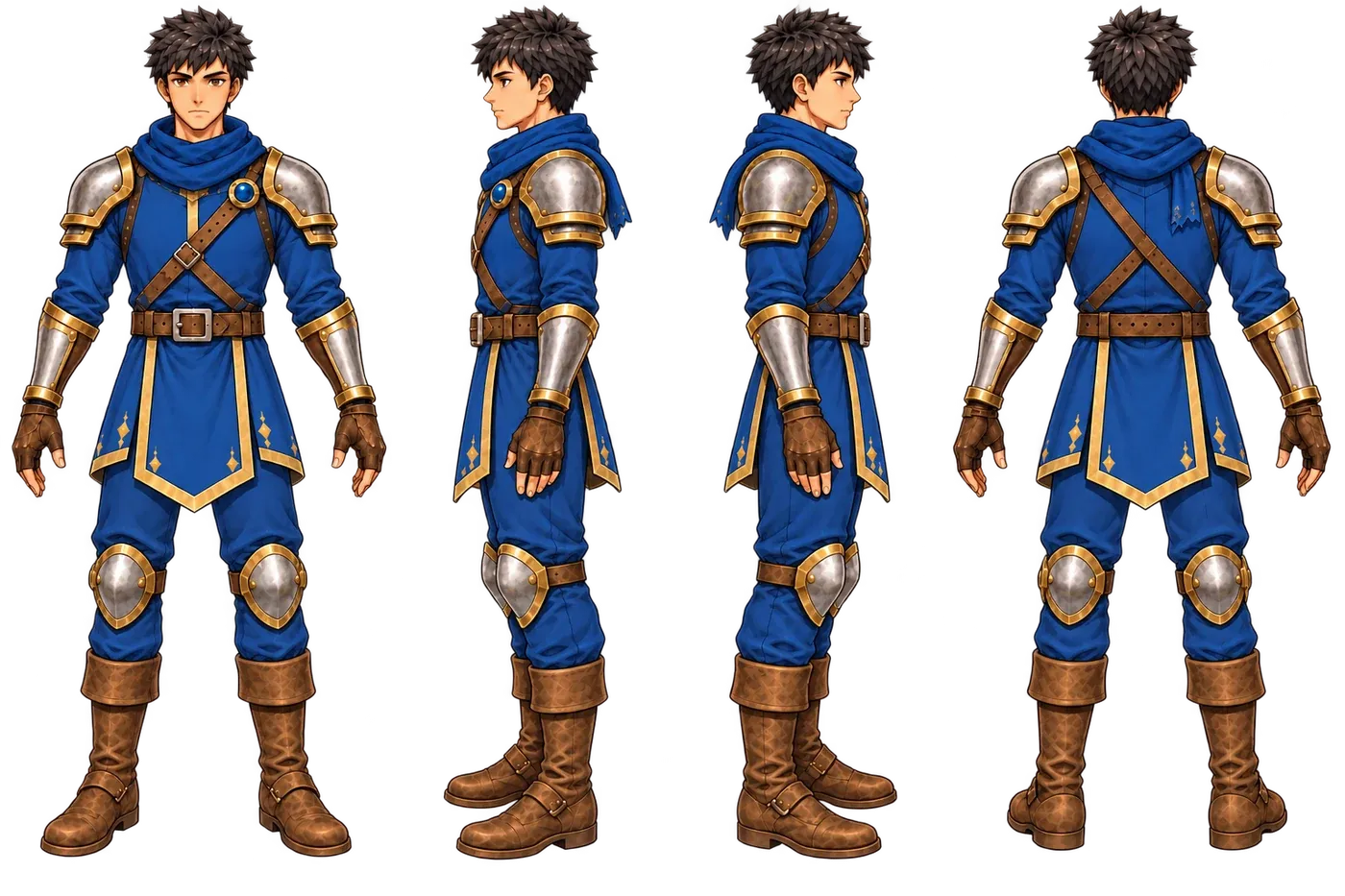
No scarf tail (just the end tucked at the nape), tabard above the knee guards, hair in locks, and a gap between arms and torso. The legibility gate opens with margin on all four views: mean value 0.50-0.53, range 0.53-0.58, three colour families.
With that sheet, the birth in 3D: 61,972 faces, an 8192² base texture, 4096² PBR maps, and a 24-bone rig at a real height of 1.75 m. Forty-five credits in total.
What 3D broke, and how it showed
Having the model is not having it solved. When the animations were transferred onto it, the automated check found two faults that are hard to catch by eye:
- 79 of 120 clips were floating. Leo sat 32 cm off the floor, lay down at 73 and died at 75. It had gone unnoticed because all 33 combat clips are standing.
- Chin pointing at the sky: +23.6° on average, +54° on stairs, and 101 of 122 clips above 15°. At rest the rig sits at 0°, so the transfer process itself was introducing it.
Both were fixed with pipeline stages, not by hand: a new one that anchors the vertical against the floor of the source clip, and another that already existed and had simply never been run on this character. Afterwards: +0.3° on average and no clip above 15.
And back to pixels
The model gets rendered and becomes pixel art again: 1,743 frames × 8 directions = 13,944 sprites. Here is the walk in profile, scaled up:
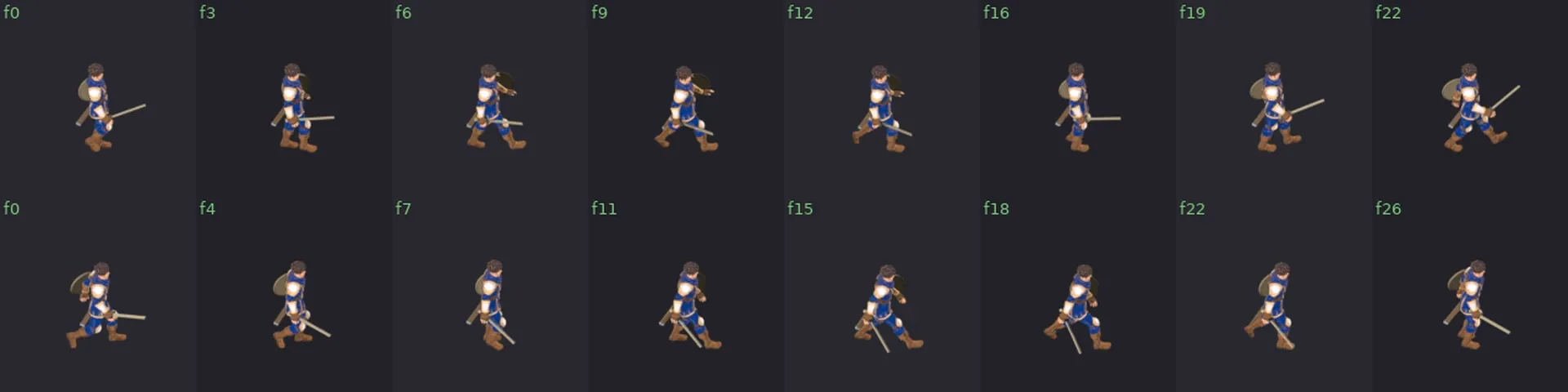
Compared with August’s PixelLab sheet, the difference is not in the drawing: it is that now every new routine comes from the same source. Before, each animation was an independent generation that had to be approved all over again.
The organic pass

With the sprites already in the game, one thing was left that numbers do not fix: the walk looked stiff. Correct, measured, and with that puppet hardness that gives away a skeleton rather than a body underneath.
Here is the comparison, front-on. On the left what there was; on the right, after the pass:
And on the diagonal, where it showed most:

The silhouette narrows, the shoulders stop sitting square and the arms hang instead of escorting the body. It is a small change in each frame and an enormous difference across the whole: the one on the right walks, the one on the left is being moved.

And that is how it ended up, in both directions:
September · Leo C, the one that stays
And then it was rebuilt again.
This is the current version, and it comes from a different base than everything before it. It is not a touch-up of August’s model: it is a new line with its own finish, the one the project calls finish C.
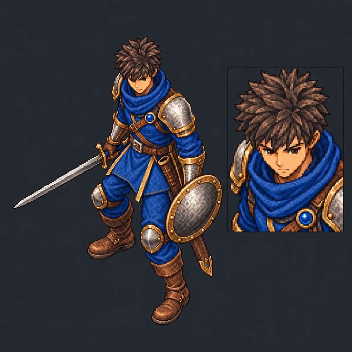
Orthographic camera at 35.264°, a 384 × 384 canvas and eight directions that are headings on the map, not anatomical sides: no view is obtained by flipping another. The sword is always in the right hand and the shield in the left, even when the character faces west.
The draw
This is the animation that defines the delivery: ninety-three frames, three seconds exactly, and in them Leo draws the sword, takes up the shield and settles into guard.

It costs more than it looks. An earlier version was rejected because the right arm and wrist deformed at the moment the blade came out — and it had passed technical review, which is the lesson: the numbers adding up does not mean it looks right. It needed a different movement base, the sword integrated again, and then tuning until the blade passed through neither body, head, shield nor its own scabbard in any frame.
Twelve revisions in four days
From there on it was almost all finish work. Face and fringe, pauldrons, knee guards, the right boot, the scarf, the left sleeve, the shield rim, the boot cuffs, the bracer, the scabbard, the grip, the straps, the leather under the pauldron, the overlap of a plate, both shield straps centred on the rim, the cloth, the metal, and finally the trim on the right knee guard.
Each one with a full backup of the previous, in case it had to go back.
What is not done yet
The repaint does not cover 360°. The areas the camera never sees in any of the eight directions still carry the original texture of the base model, without passing through finish C. It does not get in the way of playing and it can be finished without redoing a single animation, but it is undone and worth saying so.
What I take from it
Three months and three rebuilds for a character to look like himself. What made it work was not drawing better but putting the rules first: the contract that bans weapons from turnarounds, the legibility gate that measures instead of opining, and the checks that catch a character floating 32 centimetres off the ground after I had already signed off on the clip.
But the rule that cost me most to learn is the deformed arm one: a technical validation is not an artistic approval. No intersections and no bones out of range does not mean the animation looks good. Only watching it says that.
The other four heroes go through the same chain. And now the chain knows where it tends to break.