Art
The first Leo: a character for illustration, not for play
The concept everything started from, and the problem it took me a while to see: it was drawn for a still image, not for a game that has to animate it in eight directions.
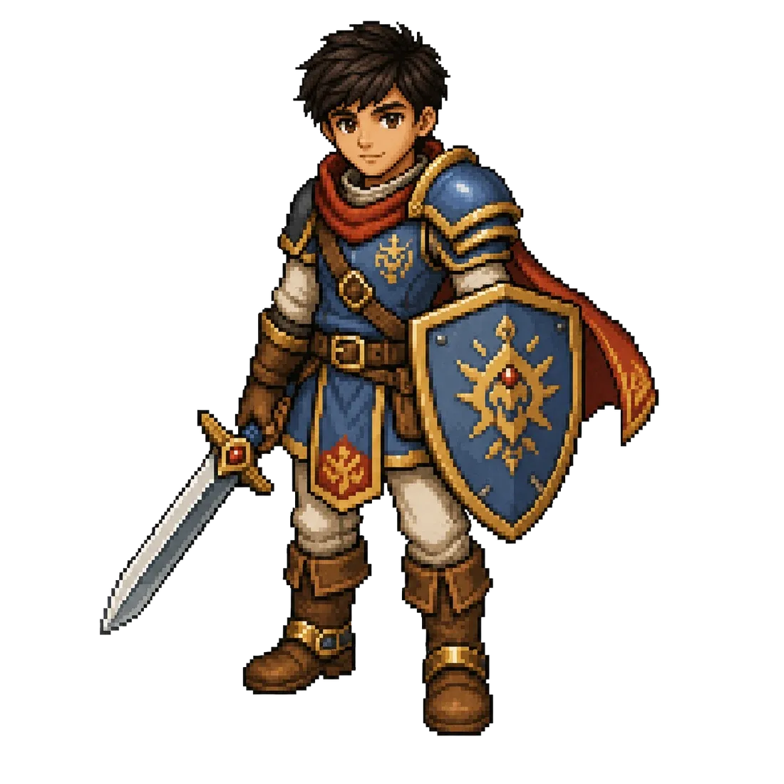
Every project starts with a drawing. This is Ascension’s: the first Leo, the hero the game opens with.
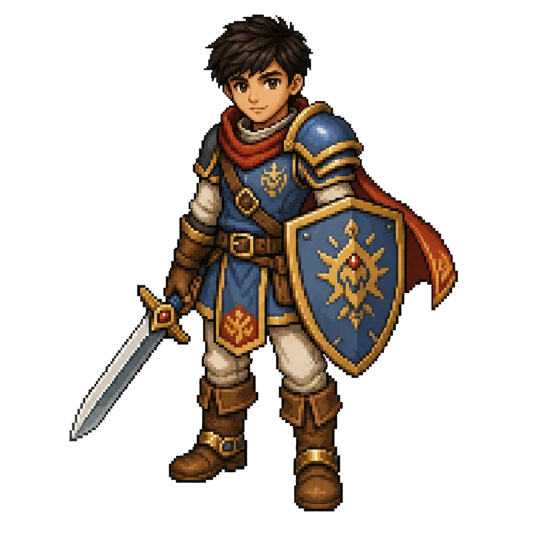
Shorter and broader than he would end up being, with a red cape in flight and a shield bearing an emblem. I liked it, and I still do.
It does have a problem, though, and it took me a while to see it: it is a character for illustration, not for a game.
The difference is not in the quality of the drawing, it is in what you ask of it afterwards. An illustration is looked at once, from one angle. A playable character has to be shown walking, attacking and dying, in eight directions, hundreds of times a session. And there the flying cape stops being a good compositional choice and becomes loose cloth that has to be animated next to the arms; and the stocky proportions, which read as character in a still, read as a puppet in motion.
None of this shows while the character stands still on a canvas. It shows the day you try to move him.
The cape was the first thing to go. It would not be the last: the tail of the scarf fell later for exactly the same reason.